The short answer
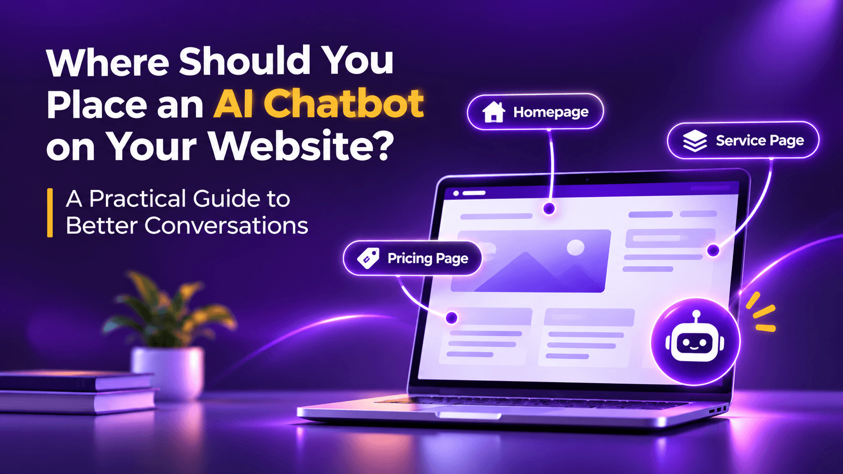
An AI chatbot for a website should be easy to find across important pages, but it should not behave identically everywhere. On a homepage, help visitors orient themselves. On a service page, answer questions about fit and next steps. On a pricing page, clarify what is included. On a campaign landing page, continue the promise made in the advertisement. On a mobile screen, make sure the chat window never becomes an obstacle. Begin with a visible, unobtrusive launcher and add proactive invitations only where they genuinely help.
This is a more useful starting point than asking whether the widget belongs in the bottom right or the bottom left. Placement matters, but the experience around that placement matters considerably more.
Why a chatbot's location is really a question about visitor intent
Imagine opening the website of a professional services firm. You are still trying to understand what the firm offers. Before you have read a sentence, a large chat window interrupts with, "Please share your mobile number." It is asking for commitment before it has offered any help.
Now imagine a different experience. You read a service description, wonder whether the service is relevant to a business your size, and notice a small invitation: "Not sure whether this is the right service? Ask me." You already have a question. The invitation feels timely rather than intrusive.
The same software can create both experiences. The difference is context.
People visit a business website with different degrees of certainty. Some are discovering a category. Others are comparing solutions, checking pricing, looking for evidence, or trying to speak with a person. A single greeting for every page treats those visitors as though they were all standing at the same point in the decision process. They are not.
I find it helpful to think of a website chatbot as a knowledgeable receptionist who understands which room the visitor has entered. A receptionist would not use an identical opening line in the reception area, the billing desk and a consultation room. Your website assistant should show the same judgement.
Start with a simple page intent map
Before choosing triggers or writing greetings, review the pages that contribute most to enquiries. Give each page one dominant visitor question. If a page serves more than one intent, choose the one you would most want the chatbot to help resolve.
This is not a rule that every business must follow. It is a starting hypothesis. A university admissions page, an industrial supplier's quotation page and a software pricing page will need different conversations. What matters is that each opening line earns its place on the page.
| Page type | Likely visitor question | Helpful chatbot opening | What to avoid |
|---|---|---|---|
| Homepage | Am I in the right place? | Need help finding the right service? | Demanding contact details immediately |
| Service page | Does this solve my problem? | Want to check whether this fits your requirements? | Repeating the page headline |
| Pricing page | What is included and what is not? | Have a question about plans or setup? | Claiming a price without knowing the plan |
| Campaign landing page | Does this deliver what the ad promised? | Looking for the solution mentioned in the campaign? | Changing the topic to a generic sales pitch |
| Blog or guide | Can I learn more? | Want a practical next step for your situation? | Blocking the article while the visitor reads |
| Contact page | How do I reach the right person? | Tell me what you need and I will help route it. | Hiding direct contact options |
1. On the homepage, help people find their way
The homepage often receives the broadest mix of visitors. A prospective customer may be exploring services. A returning visitor may want support. A job applicant may be looking for openings. Starting every conversation with a sales qualification script makes the experience feel tone deaf.
An effective homepage assistant can offer two or three clear directions: explore services, discuss a requirement, or contact the team. If the business has a high volume of unrelated enquiries, one brief category question can prevent visitors from being routed incorrectly.
For example, the opening might be: "Welcome. Are you exploring our services, looking for support, or trying to reach the team?" The next answer should be useful. Only after a visitor signals interest in a consultation should the assistant consider collecting a name or number.
Keep the launcher visible without covering the primary call to action. If the homepage has a sticky mobile contact button, test the two elements together. A chatbot that hides the contact button may reduce usability even while increasing chatbot opens.
2. On service pages, resolve the doubt behind the enquiry
Service pages are often where visitors move from curiosity to evaluation. They may understand the category but remain uncertain about scope, compatibility, timelines, eligibility or suitability.
A generic "How can I help?" works, but a more specific question gives the visitor a better reason to respond. On a website development page: "Are you planning a new website or improving an existing one?" On an education counselling page: "Would you like help finding the right programme for your background?" On a manufacturing page: "Need to check whether this product fits your application?"
The assistant should be able to answer factual questions using approved business information. If the business has not supplied a clear answer, it should say so and offer a human follow up rather than inventing a promise.
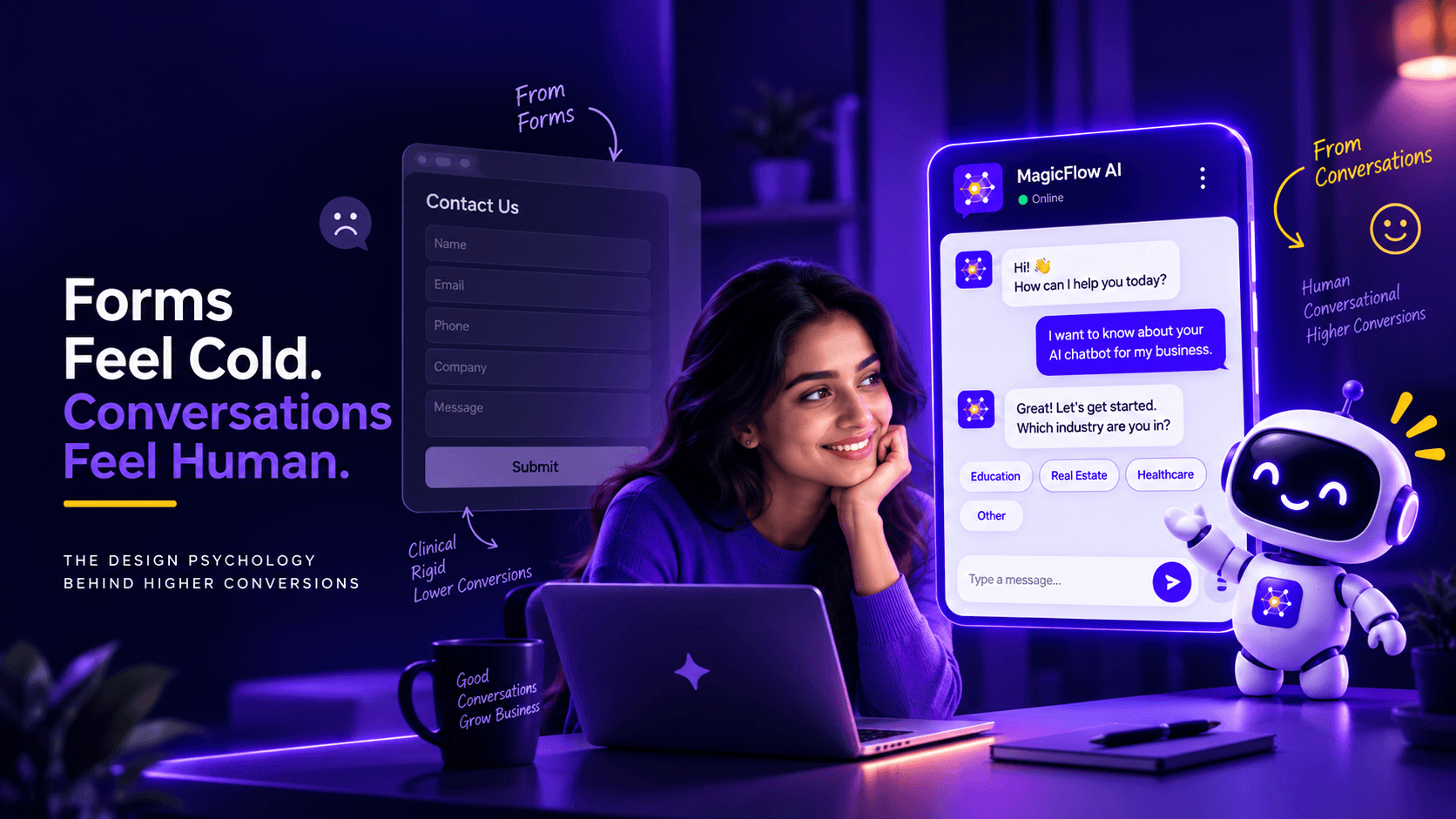
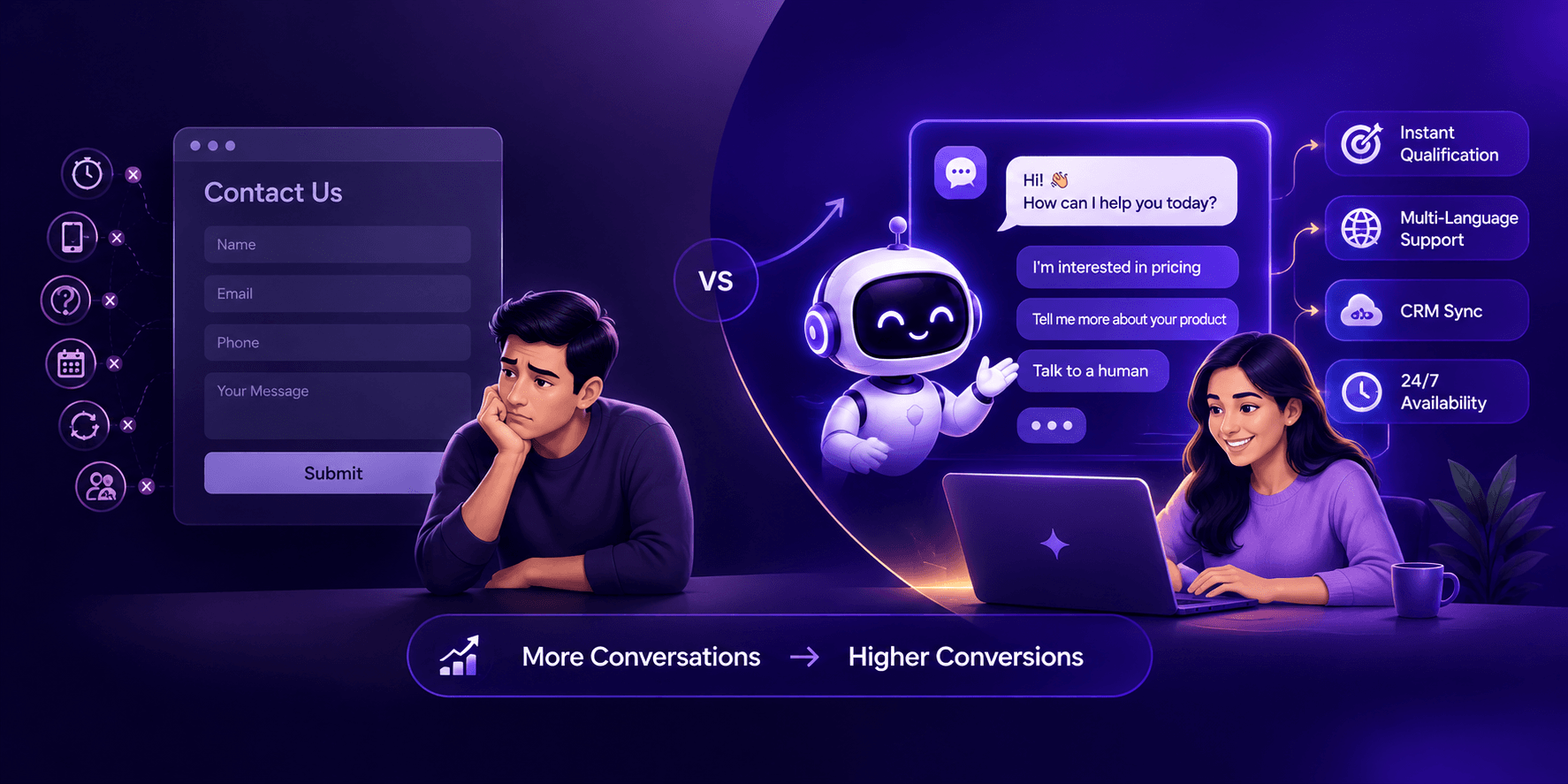
Useful conversations can become qualified enquiries naturally. A visitor who asks whether a programme accepts working professionals has already revealed more context than a cold form submission. The next step might be to explain eligibility, ask about the intended intake, and then offer a counsellor call. The order matters: help first, qualification second. For more on turning these conversations into pipeline, see our guide to AI chatbots for lead generation.
3. On pricing pages, clarify rather than pressure
Pricing pages attract visitors who are actively evaluating. They may want to understand usage limits, implementation charges, what is included, whether an existing system can be connected, or what happens after the trial.
A chatbot can help by pointing to an accurate plan comparison and resolving specific questions. It should not obscure the table, invent discounts, or imply that a quote is binding when a custom scope is still required.
A suitable prompt is: "Comparing plans? I can help explain what is included and what to ask before choosing." If the visitor asks for a tailored quotation, the chatbot can collect the minimum information needed for a human conversation.
There is a second design point here. Some visitors want to study the plans quietly. Do not mistake time spent on a pricing page for permission to interrupt. A small prompt after meaningful engagement may be appropriate, but the safest first version is usually a clear, accessible launcher with an optional invitation.
4. On paid campaign landing pages, preserve continuity
Campaign visitors arrive with a promise already in mind. If an advertisement says "Book a consultation for your admissions process," the landing page and chatbot should not suddenly steer the person toward an unrelated product introduction.
The first conversation should acknowledge the page's subject and make the advertised next step easier. Consider a visitor who clicked a Google advertisement for an MBA programme. An appropriate opening could be: "Looking at this programme? I can help with eligibility, fees or the next intake." That keeps the conversation connected to the reason for the visit.
Source attribution is also valuable. MagicFlow AI supports capturing campaign parameters and page context, which can give a sales team information about where the enquiry originated. But attribution is only useful when the message and the campaign are both consistent. A visitor should not have to explain the advertisement they just clicked.
Avoid changing campaign claims inside the chatbot. If the advertisement promises a particular offer, the chatbot should reflect the approved terms or acknowledge when it cannot verify them. Precision is more persuasive than an enthusiastic but inaccurate response.
5. On blogs, give the reader room to read
A blog visitor may still be researching a problem rather than shopping for a solution. Opening a chat window over the first paragraph is rarely a thoughtful welcome. It interrupts the task the visitor came to complete.
For informative articles, begin with a quiet launcher. Consider a contextual invitation near a relevant section, at the end of the article, or after the visitor has shown genuine engagement. The invitation should offer a bridge from reading to action: "Want to apply this checklist to your website?" is more useful than "Buy now."
This distinction also protects trust. If every educational page becomes a lead capture trap, readers may stop seeing the website as a useful resource. Good commercial content earns the right to invite a conversation.
Decide when a chatbot should speak, not just where it sits
Visibility and initiation are separate decisions. A launcher can remain present on every page while proactive messages vary by context. Three common patterns are worth testing.
1. Visitor initiated
The widget stays closed until someone clicks it. This offers maximum control and suits many informational pages.
2. Contextual invitation
A small, dismissible prompt appears after the visitor has spent time on a relevant page or reached a meaningful section. This can work on service and pricing pages.
3. Event based assistance
A visitor takes an action that suggests a specific question, such as opening plan details or requesting a comparison. The assistant offers help related to that action.
Start with one rule per page template
The temptation is to use every signal at once. That often creates noise. Start with one simple rule per page template. If the visitor dismisses a prompt, respect that choice during the session. Never let repeated invitations become a substitute for a clear page design.
It is also worth recognising that the ideal delay cannot be chosen from a universal benchmark. A lengthy industrial specification page may warrant a different approach from a short course enquiry page. Measure how visitors behave rather than treating an arbitrary number of seconds as best practice.
Mobile placement deserves its own review
Mobile screens are unforgiving. An element that looks discreet on a desktop can cover a primary button, payment control or important section on a phone. A full chat window can also trap a visitor in an interface that is difficult to close.
Test common screen widths, orientation changes and the virtual keyboard. Check whether the close control is easy to reach and whether the visitor can resume reading in the same place. Make sure the widget does not overlap cookie notices, sticky navigation, WhatsApp buttons or accessibility controls.
Use short messages. Ask one question at a time. Keep choices readable and avoid forcing visitors to scroll through a long automated monologue. If a user has already entered information, do not ask for it again without reason.
Accessibility is part of conversion, not a separate cosmetic concern. The W3C's WCAG 2.2 guidance explains that keyboard focus should not be completely hidden behind author created content, including persistent chat interfaces. A practical review should check keyboard access, visible focus, screen reader labels, contrast and a reliable way to close the panel.
The opening line is a design decision
A useful opening message should do three things: show that the assistant understands the page, offer help without demanding anything, and give the visitor control. It does not need to sound overly clever. Consider these pairs.
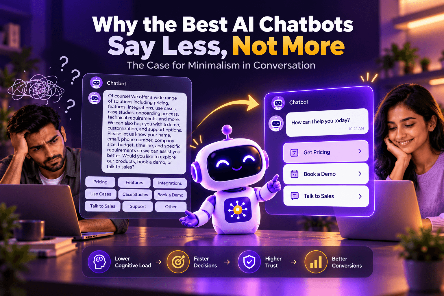
The second version in each pair makes a smaller promise and gives a clearer reason to engage. It also reduces the pressure felt by a visitor who is not ready to speak with sales. We explore this idea further in why AI chatbots should say less, not more.
| Less helpful | More helpful |
|---|---|
| Hello! Please enter your phone number. | Looking for a service or have a specific question? |
| Welcome to our AI powered platform! | Comparing the plans? I can clarify the differences. |
| We are available 24/7. Talk now! | Want help checking whether this service fits your needs? |
| Click here for the best offer! | Want to understand what is included before deciding? |
Give the assistant enough context to be genuinely useful
A page aware chatbot needs reliable information. At minimum, give it the current page title or content category, approved answers to common questions, escalation instructions, and the specific fields your team needs when a visitor requests contact.
Do not confuse access to a large knowledge base with the ability to answer everything correctly. An assistant must recognise missing information and avoid presenting guesses as facts. Review responses about pricing, refunds, eligibility, guarantees and delivery timelines particularly carefully.
If your site serves multiple industries, organise content so the bot does not blend unrelated policies. A response appropriate for an education programme may not be appropriate for a healthcare or financial enquiry. Context narrows the answer and makes it more useful.
The page itself should still contain essential information. A chatbot is an aid to navigation and conversation, not a reason to remove clear pricing, contact details or important service descriptions from the page.
Measure conversations that help, not just conversations that start
A widget that opens frequently can still create poor business outcomes. Track the full journey from page visit to qualified enquiry and, where possible, to a sales outcome. Start with a modest scorecard.
These figures need context. A pricing page may generate fewer chats than a homepage but a higher proportion of sales relevant discussions. A blog may generate fewer enquiries but help visitors understand the business. Do not optimise every page for the same outcome.
Also distinguish correlation from causation. If enquiries rise after adding a chatbot, the change may reflect campaign traffic, a new offer or seasonality. Compare similar periods and campaign groups, and test one design change at a time. If your platform does not yet support an automated experiment, a carefully documented before and after test is still useful, provided you note its limitations.
| Measure | What it tells you |
|---|---|
| Chat engagement by page | Which pages prompt useful questions |
| Helpful answer or resolution rate | Whether visitors receive what they came for |
| Contact capture rate | Whether conversations produce a reachable enquiry |
| Qualified enquiry rate | Whether the leads fit the intended business need |
| Human handoff completion | Whether an enquiry reaches the right owner |
| Mobile abandonment and complaints | Whether the widget disrupts the experience |
A practical four week rollout
Week 1: Map the journey
Identify the five to ten pages that matter most for enquiries. Document their visitor intent, current calls to action, mobile layout and common questions. Ask sales which questions they answer repeatedly.
Week 2: Configure restrained openings
Create page specific messages for the homepage, one important service page, a pricing page and a paid campaign landing page. Keep the launcher accessible and avoid multiple simultaneous prompts. Review knowledge sources and escalation instructions.
Week 3: Test with real questions
Ask colleagues who did not configure the chatbot to attempt typical visitor tasks. Can they obtain a correct answer? Can they choose not to chat? Can they reach a person? Does the panel interfere with mobile navigation? Record failures, not just successful demos.
Week 4: Review outcomes
Compare engagement, qualified enquiries and handoff quality by page type. Read a sample of conversations with appropriate privacy controls. Adjust one weak opening or placement rule, then observe the result. Do not rewrite the entire experience after a few unusual chats.
A rollout is successful when the visitor finds the right next step more easily and the business can handle the resulting enquiry. More chat windows on more pages are not a meaningful success measure on their own.
Common mistakes that make chatbots feel intrusive
One mistake is asking for personal information before answering a simple question. Another is showing an identical pop up on every page. A third is covering the main mobile call to action. Others include ignoring a user's dismissal, using a chatbot to hide contact information, allowing the assistant to invent policies, and treating every conversation as a qualified prospect.
These are not problems that can be fixed by changing the button colour. They come from failing to decide what kind of help belongs at each stage of the journey.
MagicFlow AI is designed around website conversations, lead qualification, page and campaign context, branding and routing. Those capabilities become most useful when the business defines the experience deliberately. The technology can make the conversation possible, but the business still has to decide what a good conversation means.
The point is to make the next step easier
A well placed chatbot feels less like an interruption and more like a useful part of the website. It helps the visitor make progress from the page they are on. Sometimes that progress is an answer. Sometimes it is a clearer comparison. Sometimes it is a conversation with a person.
If you are considering an AI chatbot for your website, begin by mapping the moments when visitors need help. Then design the chatbot around those moments, not around the desire to collect another phone number. MagicFlow AI can support that approach with configurable qualification, contextual information and lead routing. The starting point, however, is still a simple question: what does this visitor need right now?
- MagicFlow AI, Features https://www.magicflowai.io/features
- W3C, Understanding Success Criterion 2.4.11: Focus Not Obscured (Minimum), WCAG 2.2 https://www.w3.org/WAI/WCAG22/Understanding/focus-not-obscured-minimum
- Google Search Central, Creating helpful, reliable, people-first content https://developers.google.com/search/docs/fundamentals/creating-helpful-content
Common questions from this article.

Chief Marketing and AI Officer (CMAIO), MagicWorks IT Solutions
Mohan Chute is Chief Marketing and AI Officer at MagicWorks IT Solutions, with 23+ years across go-to-market strategy, technology, and digital transformation. He built and scaled MagicFlow AI from concept to client deployment and pioneered the agency's AEO/GEO practice, helping brands earn visibility in AI-generated answers across ChatGPT, Perplexity, and Gemini.